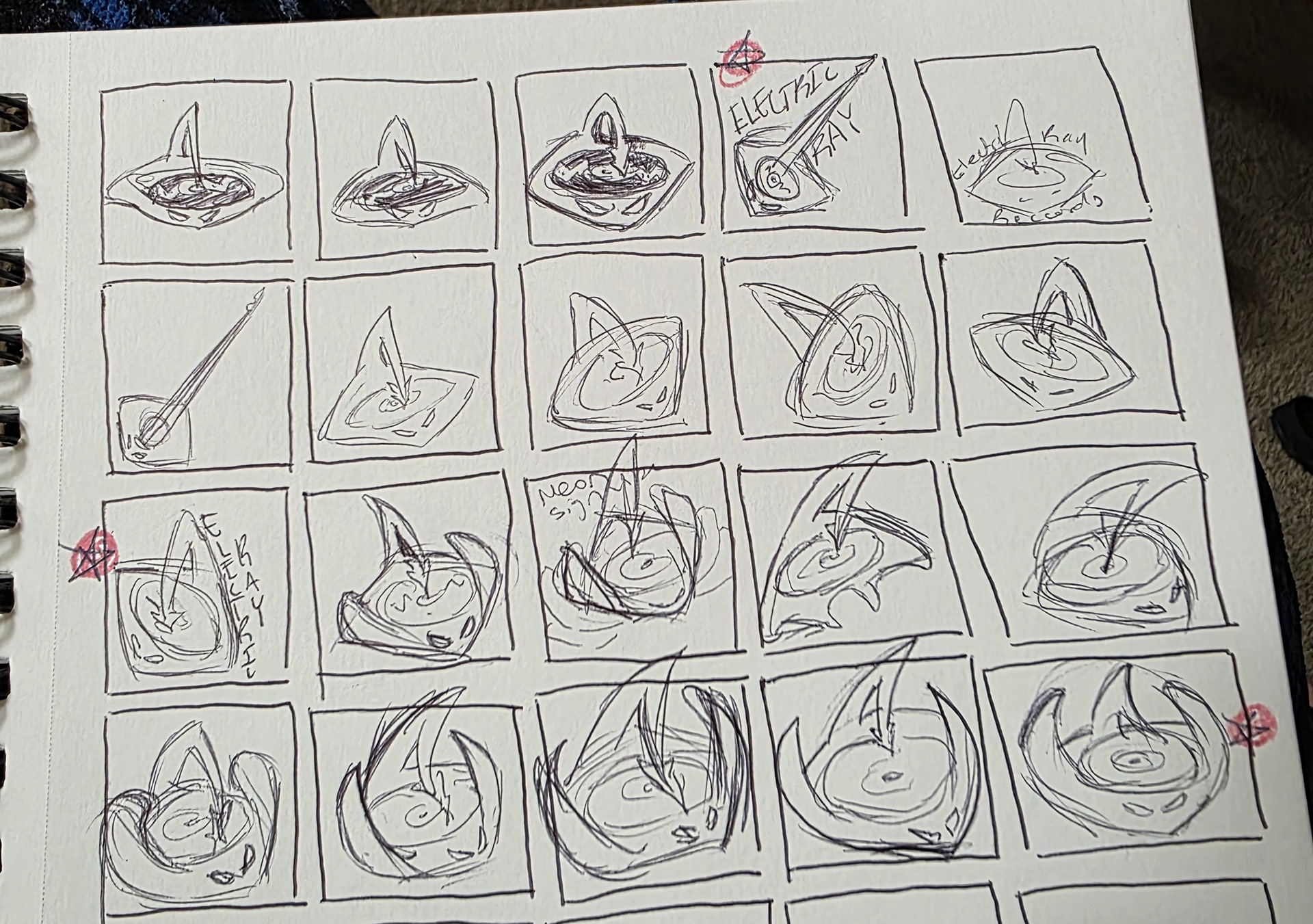
Electric Ray Records is a record shop and recording studio startup in Grand Rapids, MI. I was commissioned to create a logo for the company. The client requested that the logo depict a stingray, ideally centering a vinyl record. I created a multitude of thumbnails, jotting down ideas to decide angles, shapes, and simplicity.
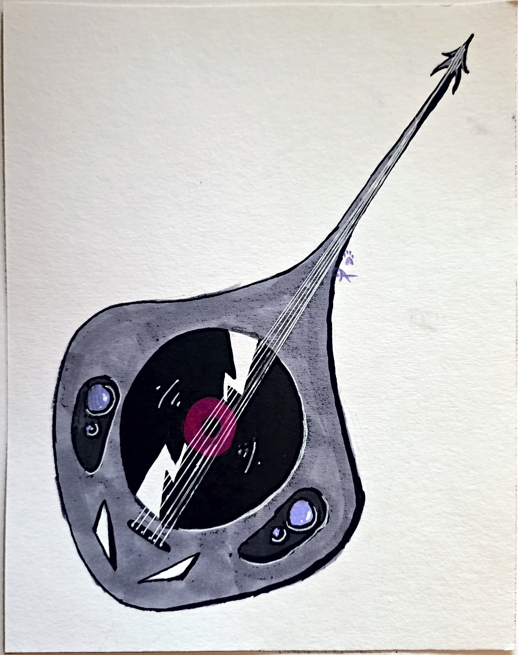
After choosing the strongest three sketches, I further developed them into comprehensive drawings using ink and alcohol markers. I wanted to use liquid ink on a brush to get the very specific stroke style I wanted down on paper to be later replicated in Adobe Illustrator.
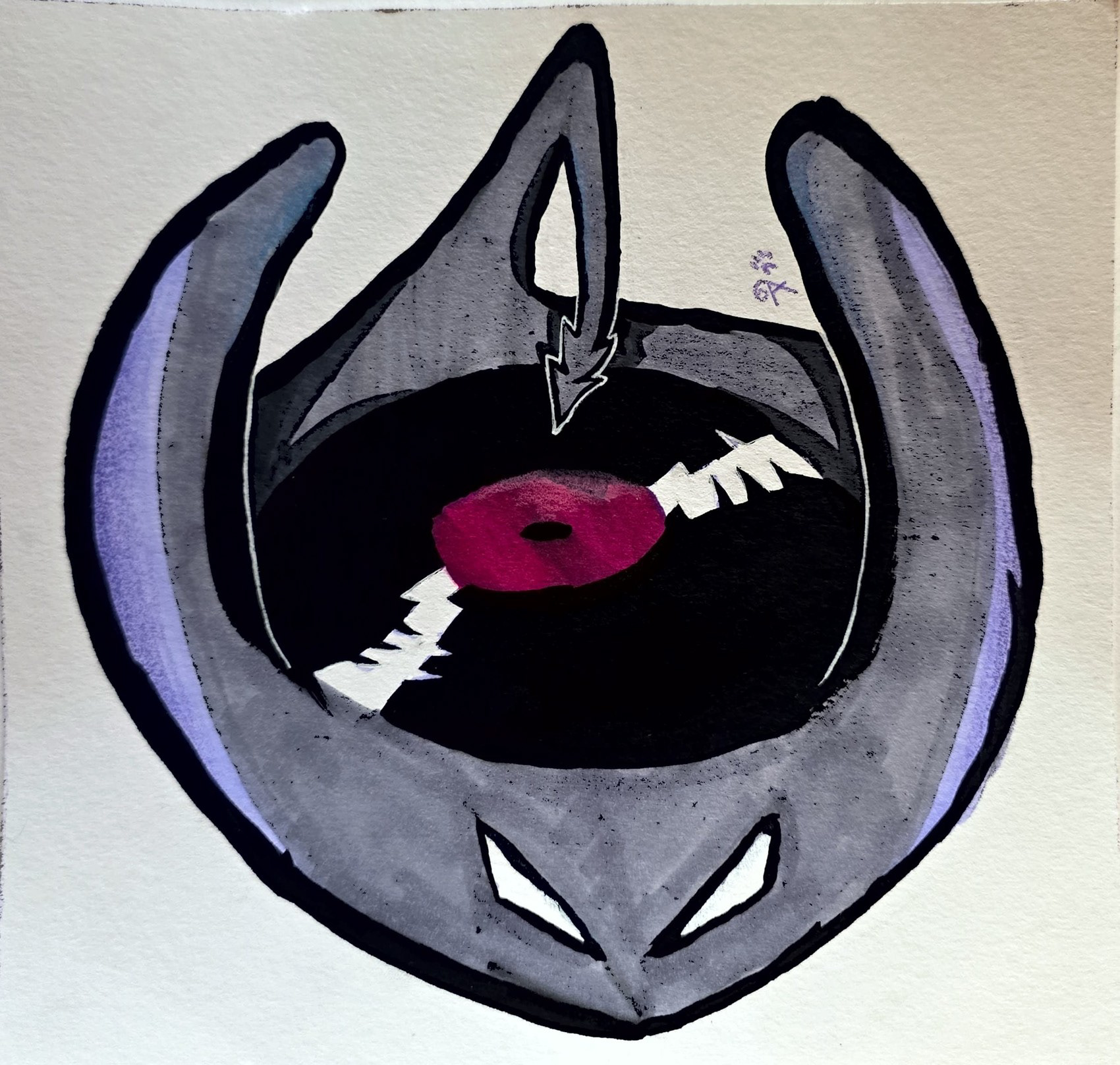
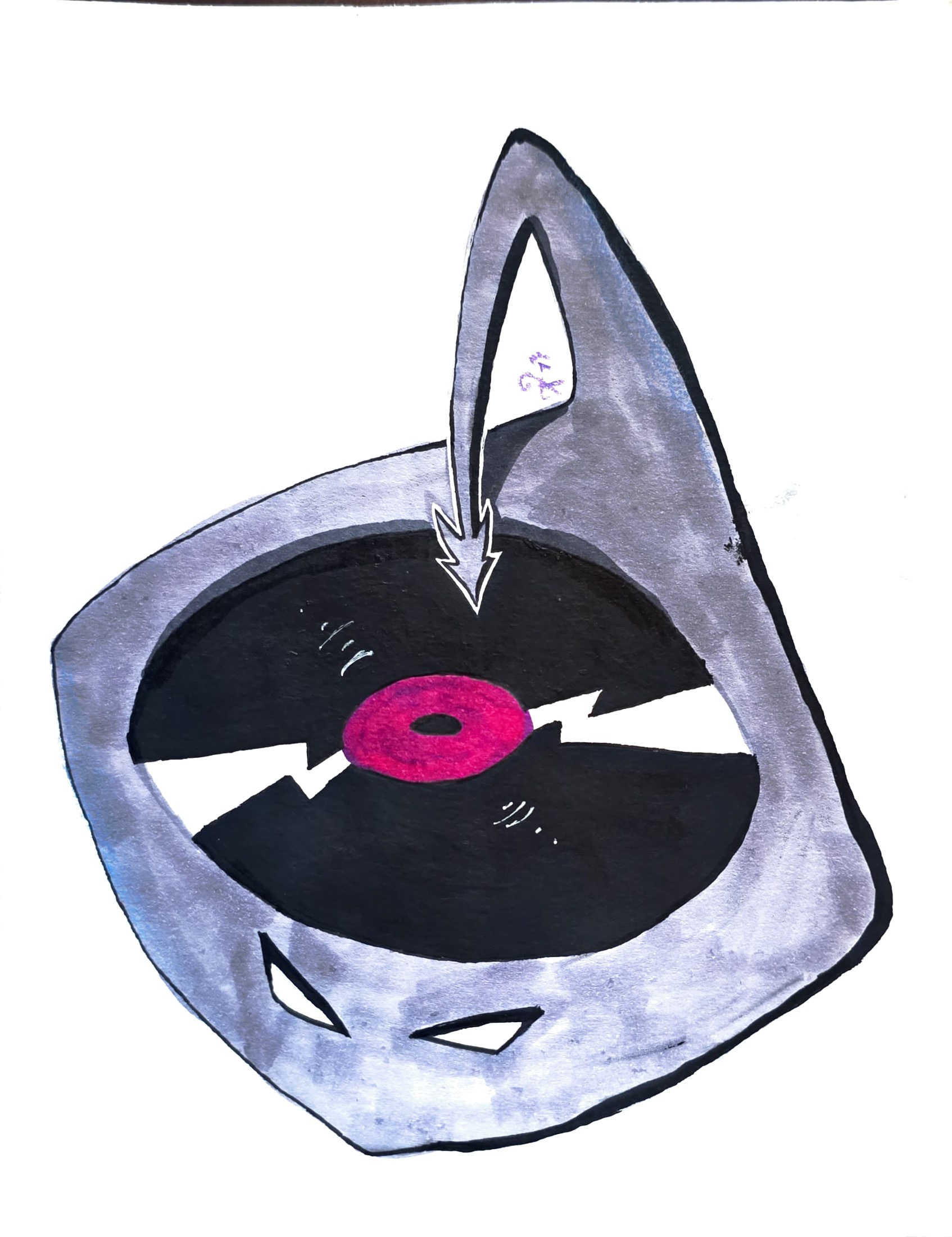
The client ended up liking two of the designs instead of just one and decided to go with both. The client didn't like how sharp and "cool" the eyes were looking because they wanted a slightly cuter look. They agreed that making the eyes smaller and sparkly (similar to designs like Hello Kitty) could give the eyes the cuter look they were going for.


Upon seeing the first rendition of the logo, they decided against the beadier eyes and we instead decided to try adding pupils to the eyes to give them that softer feel. I also altered the line weight to soften out some of the sharper curves.


We also wanted to add a bit more of the color in the center of the record, so we added the vibrant purple color to the pupils, which helped soften the character just the right way.
The client was happy with this rendition and is now planning to use it on socials and in marketing.