Logo
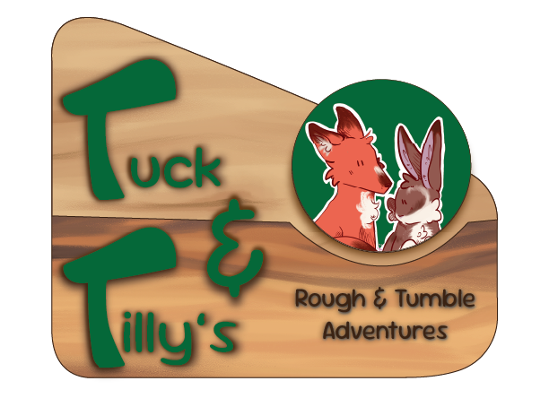
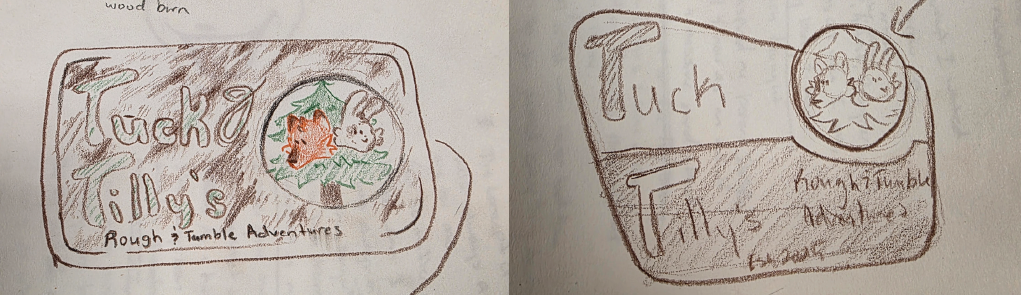
When creating the logo for Tuck and Tilly, there were many ideas,
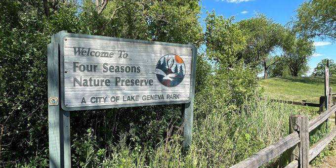
but the one that stuck was wildlife park signs. The rustic and woodsy feel connected with the setting and themes of the story and felt right.
but the one that stuck was wildlife park signs. The rustic and woodsy feel connected with the setting and themes of the story and felt right.
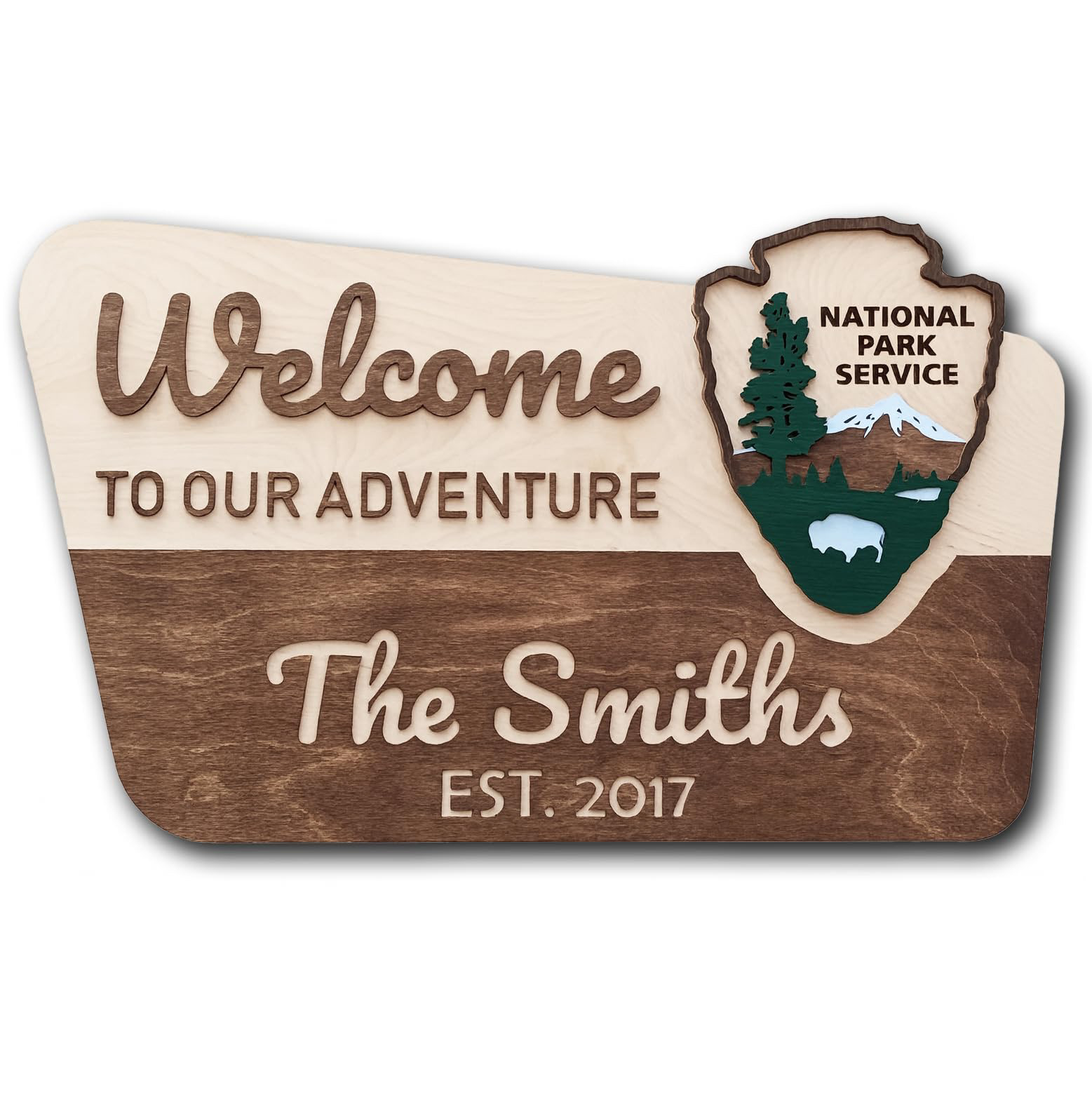
I was drawn to the wood-burnt texture and carving that many of the signs I took inspiration from featured. The strong, contrasting colors of the signs also felt fitting for a logo that could be understood in multiple sizes.
While looking online, I was unsatisfied with the wood textures I was finding and decided to create my own in adobe Photoshop.
Illustrations
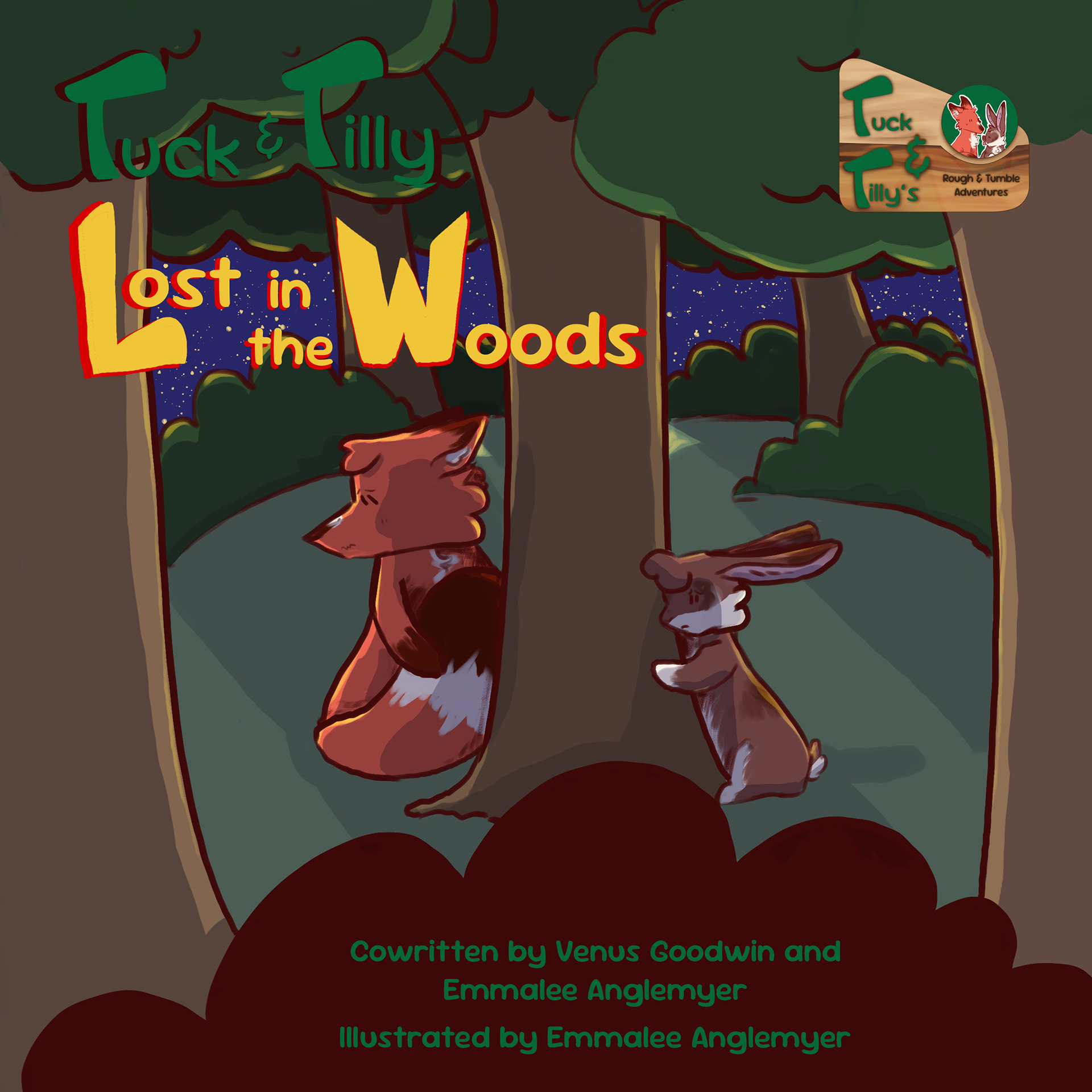
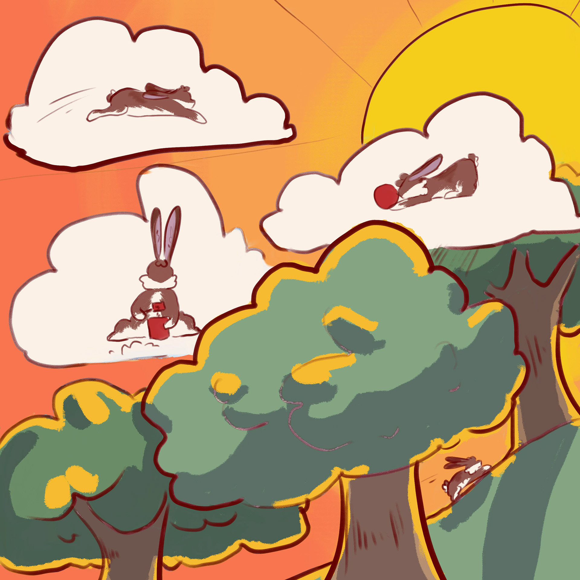
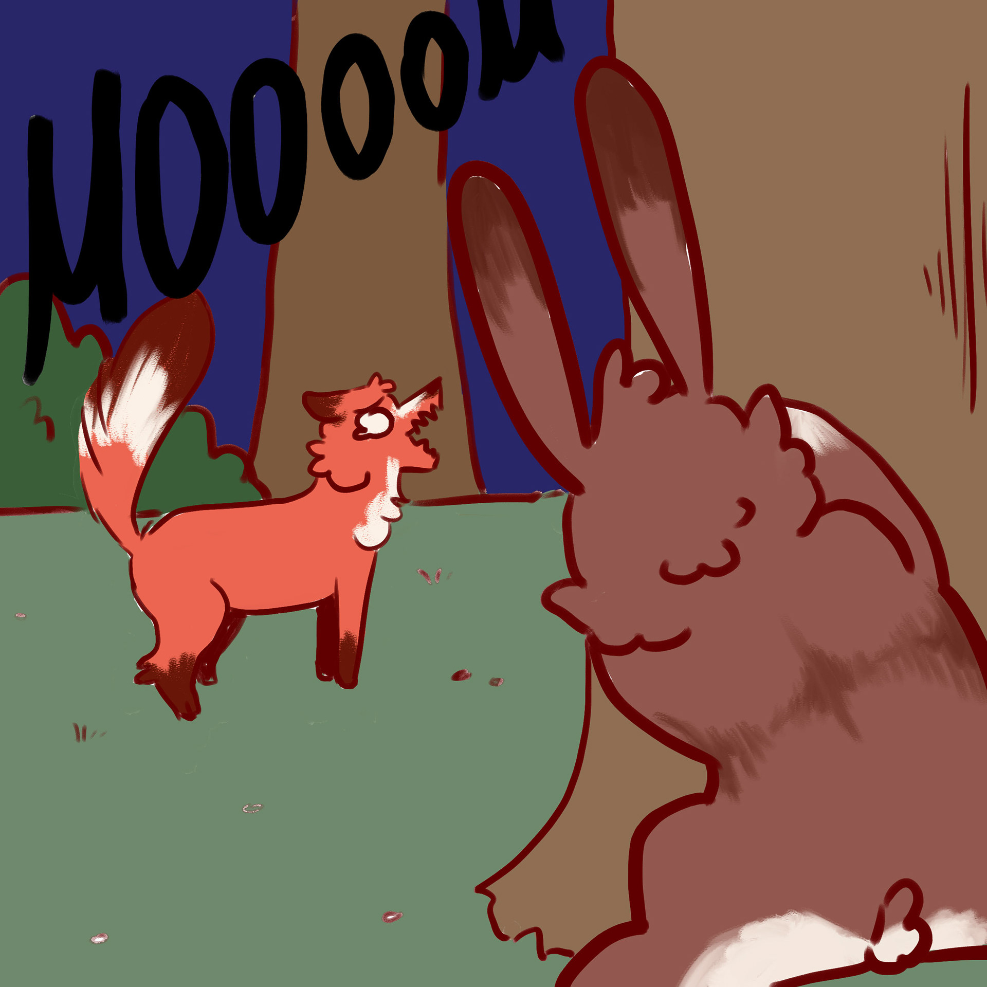
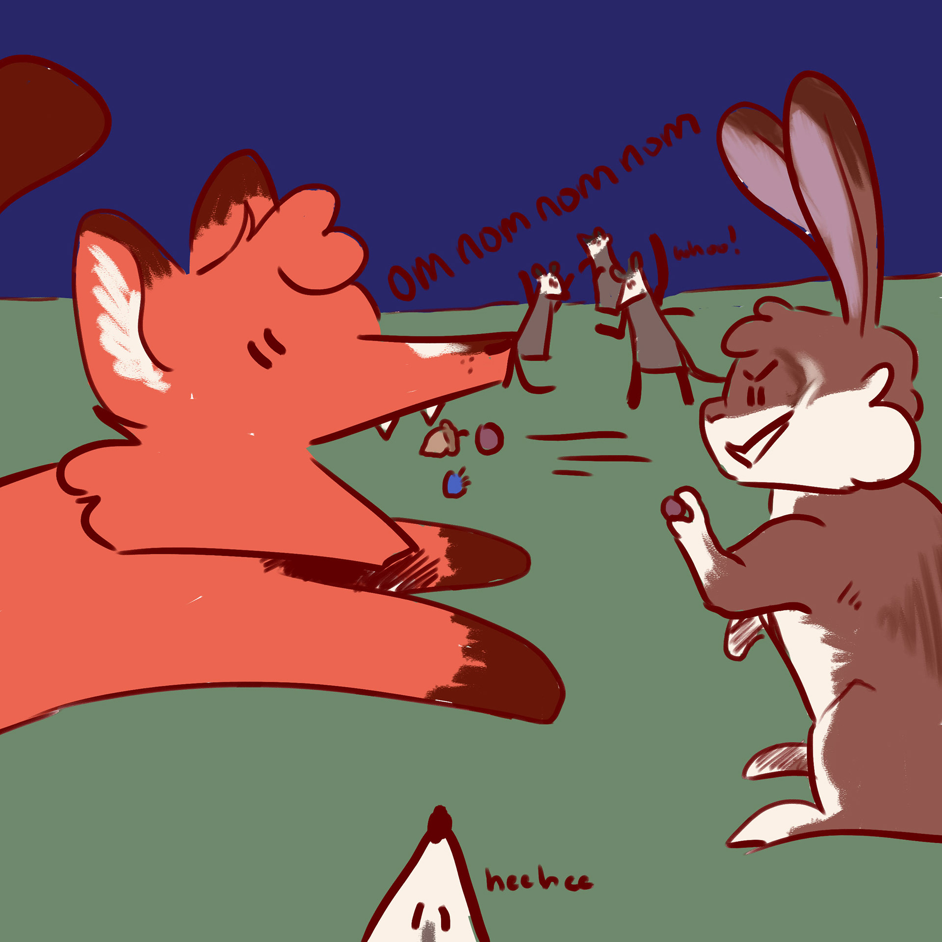
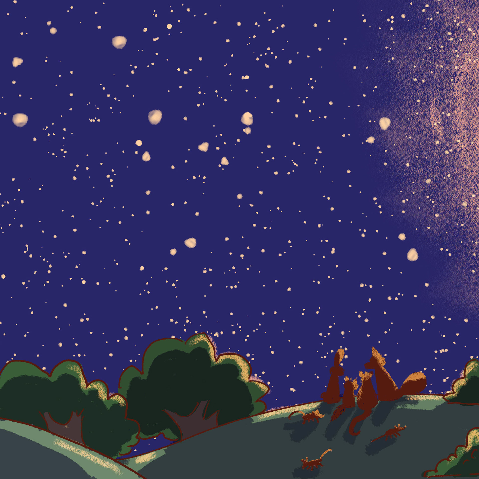
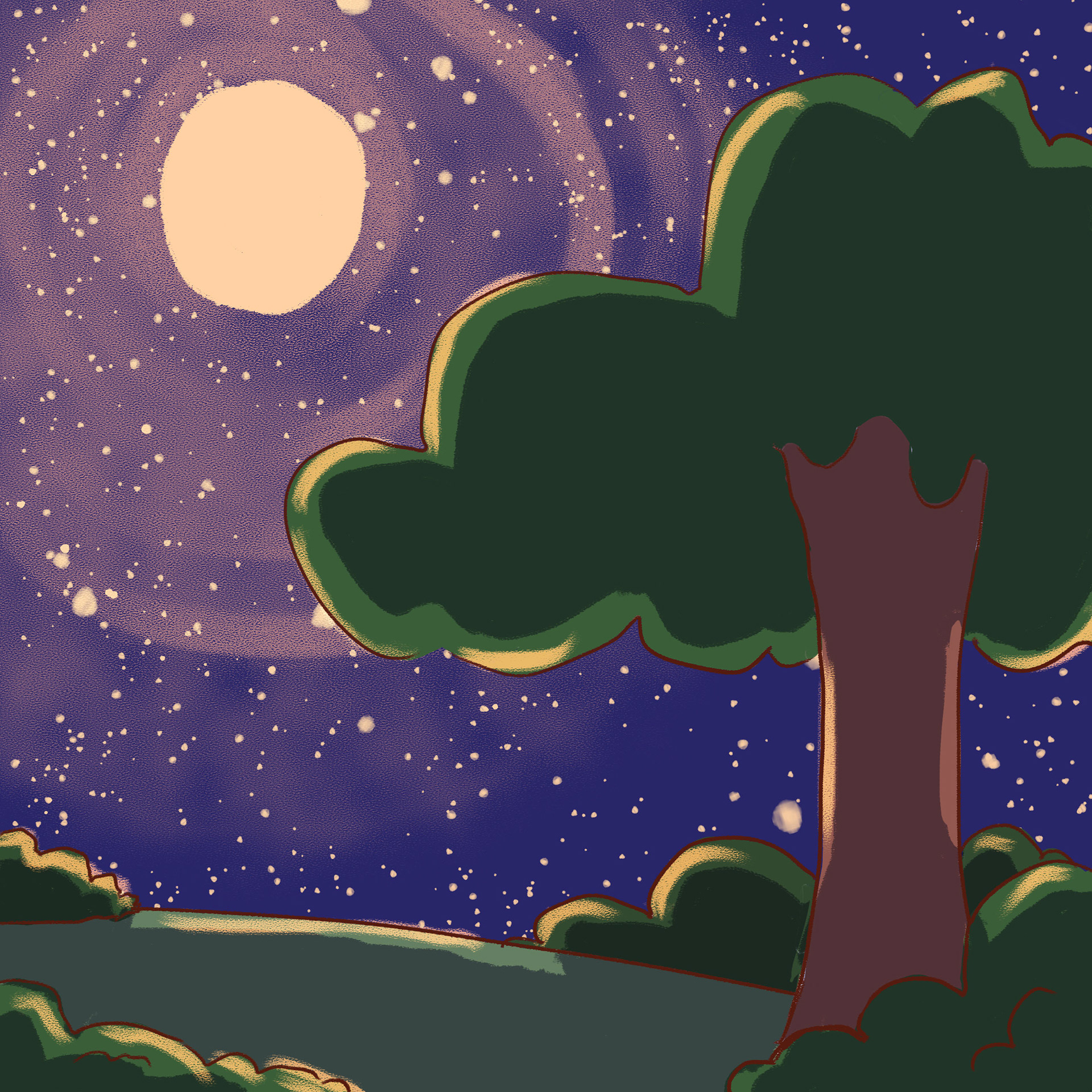
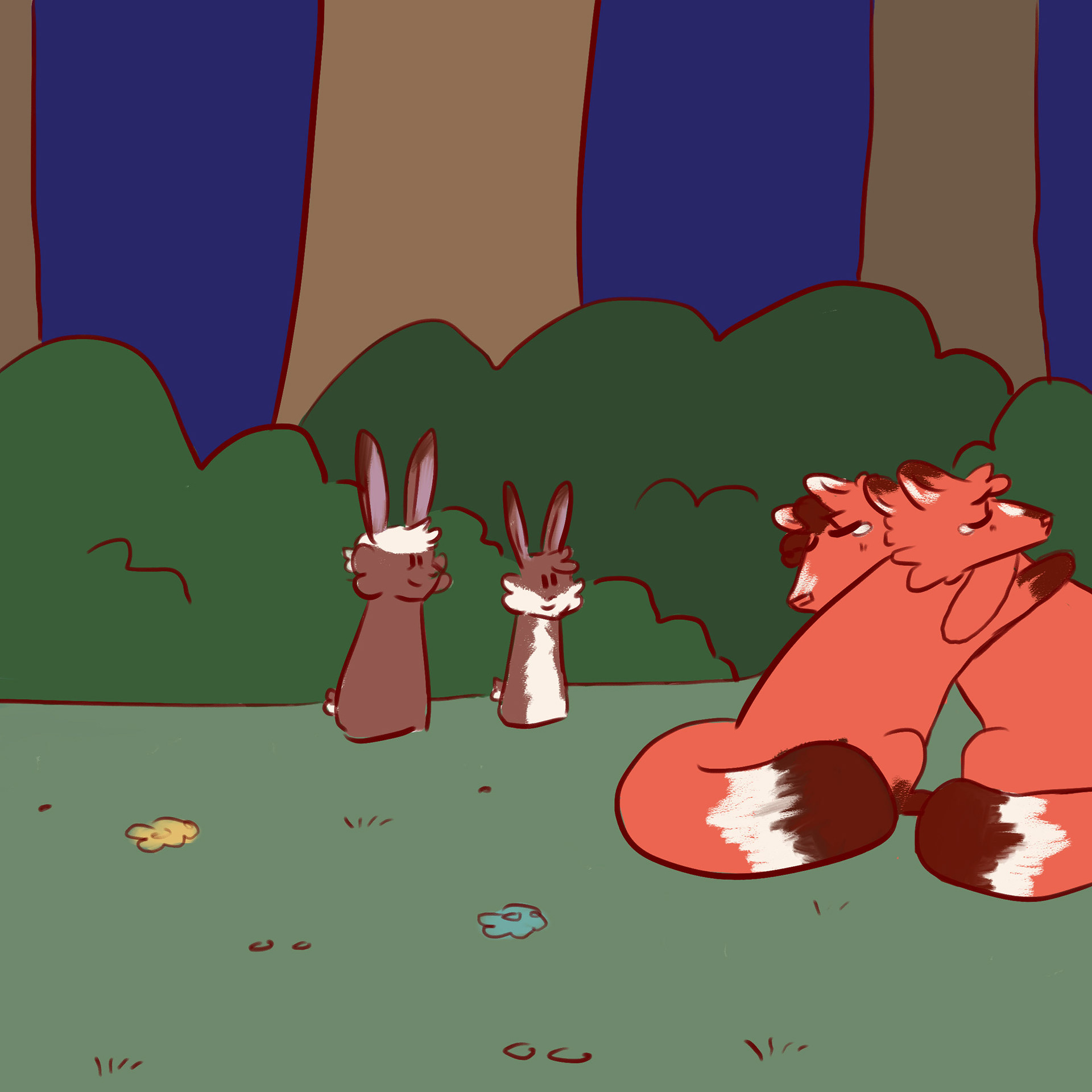
Originally I wanted to illustrate the book with gouache and watercolor paint, however digital illustration in Photoshop presented to be the most practical option to reach the exhibition's deadline. The illustration style was inspired by the children's books and cartoons from my own childhood.
In total I created 52 colored illustrations for Tuck and Tilly: Lost in the Woods over months.
Stickers
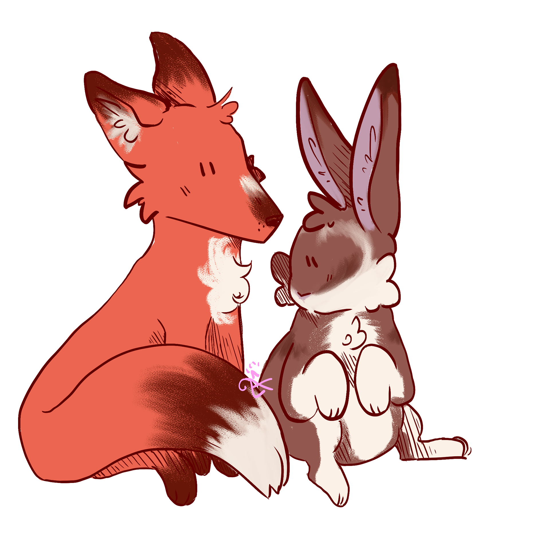
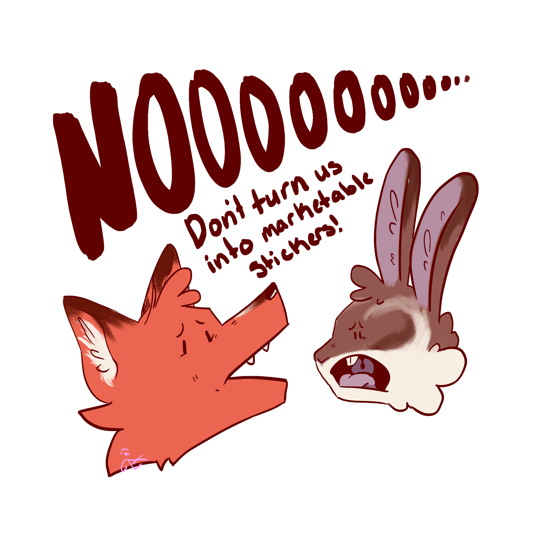
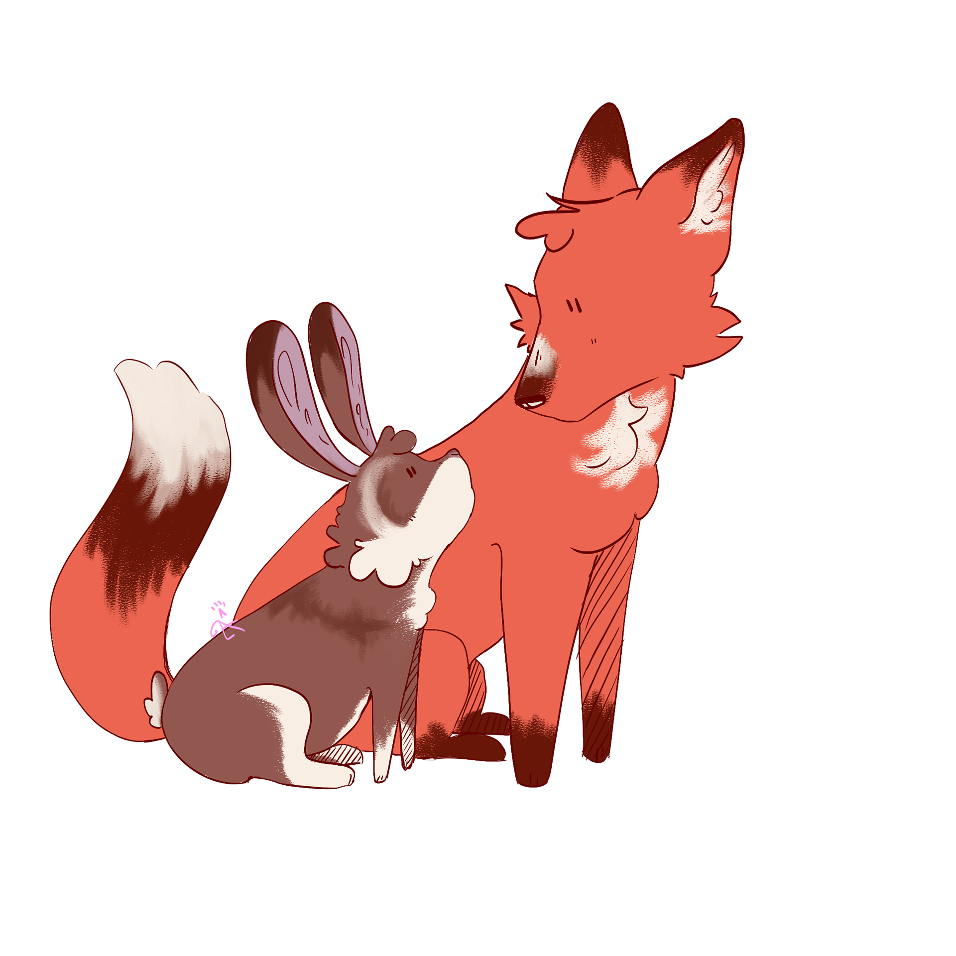
My goal was to create not only a book with a good story for kids, but also to establish a potential brand around it, including merchandise.
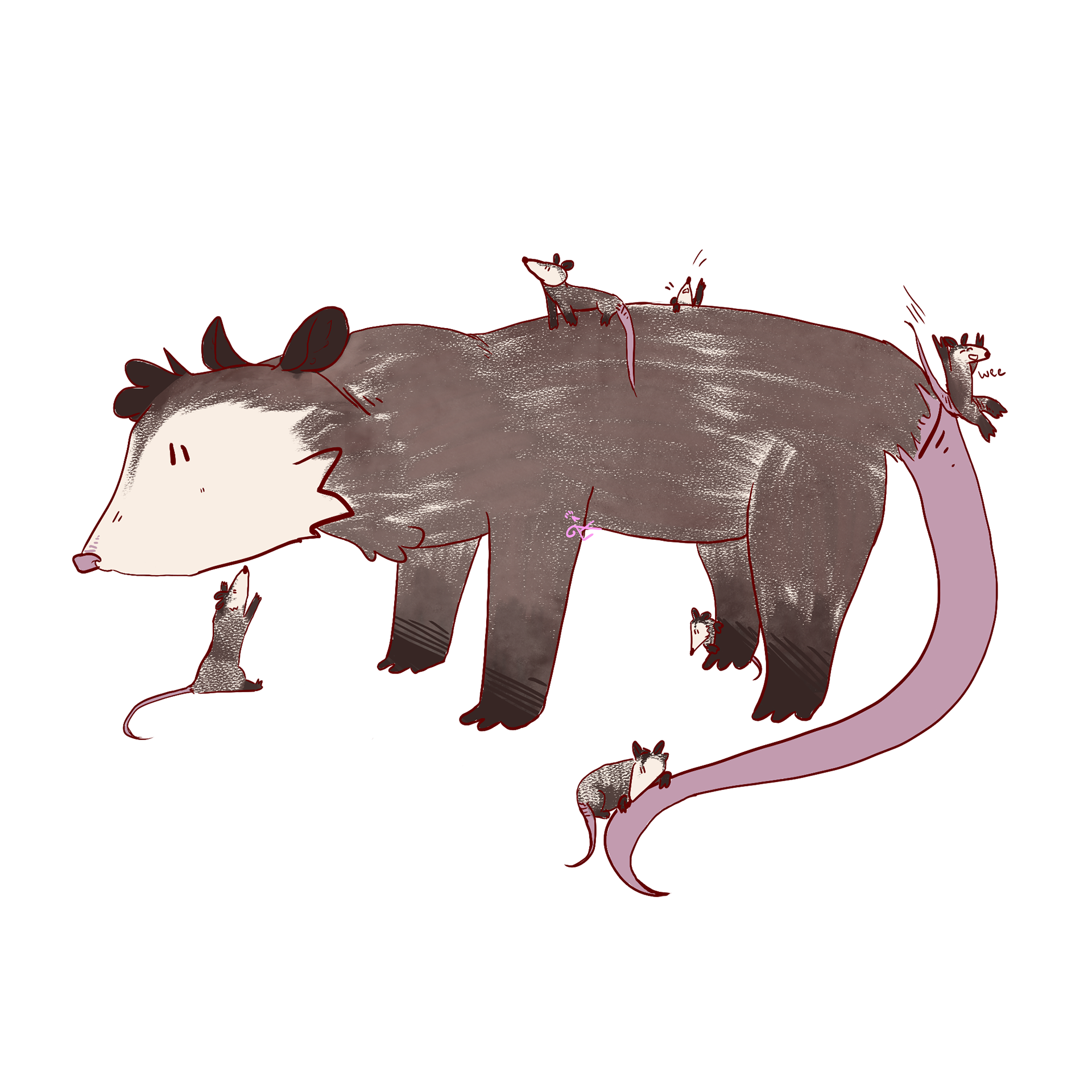
These stickers were illustrated in Photoshop, printed at a local Staples, and cut both by hand and machine.
Posters
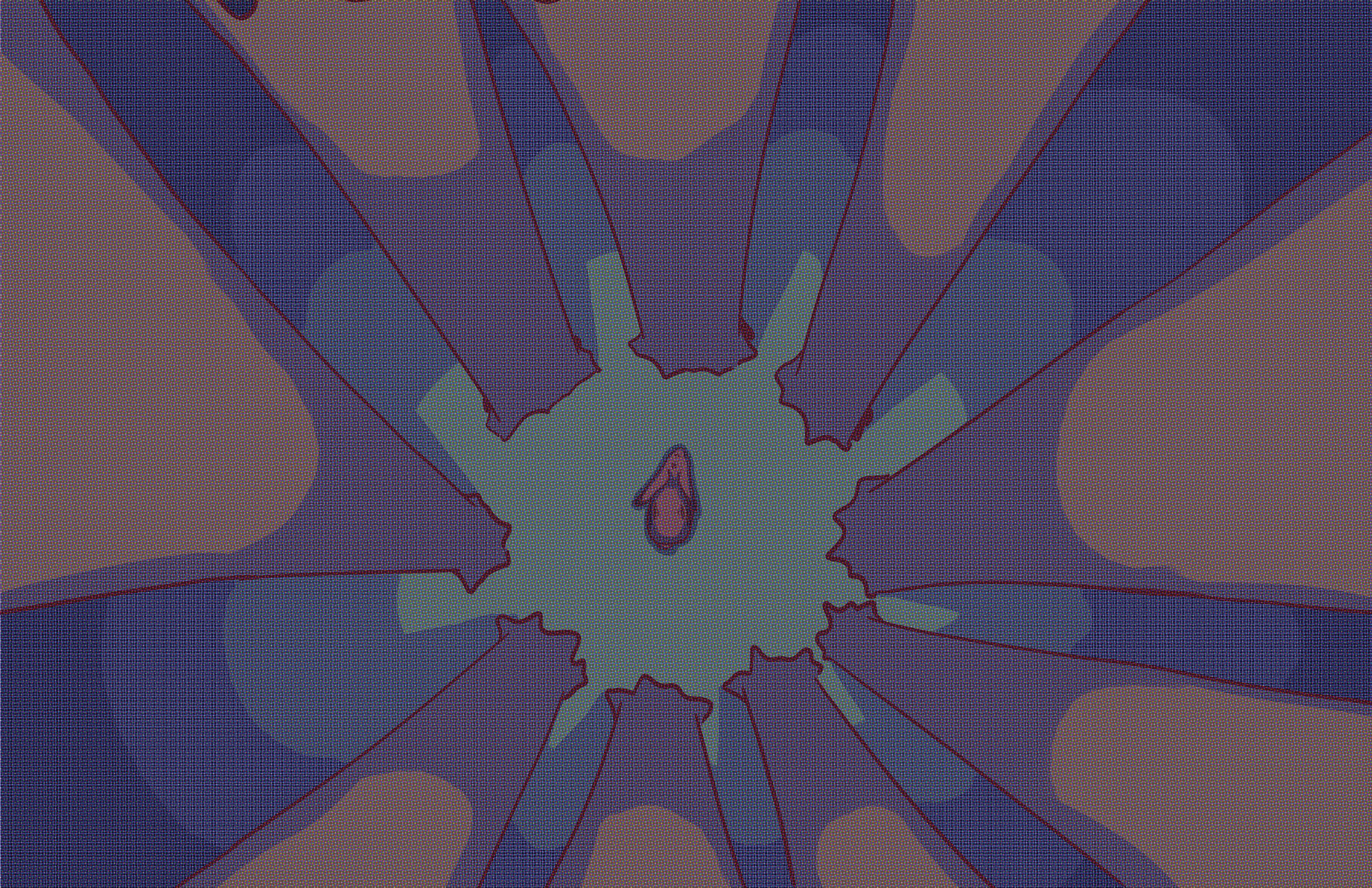
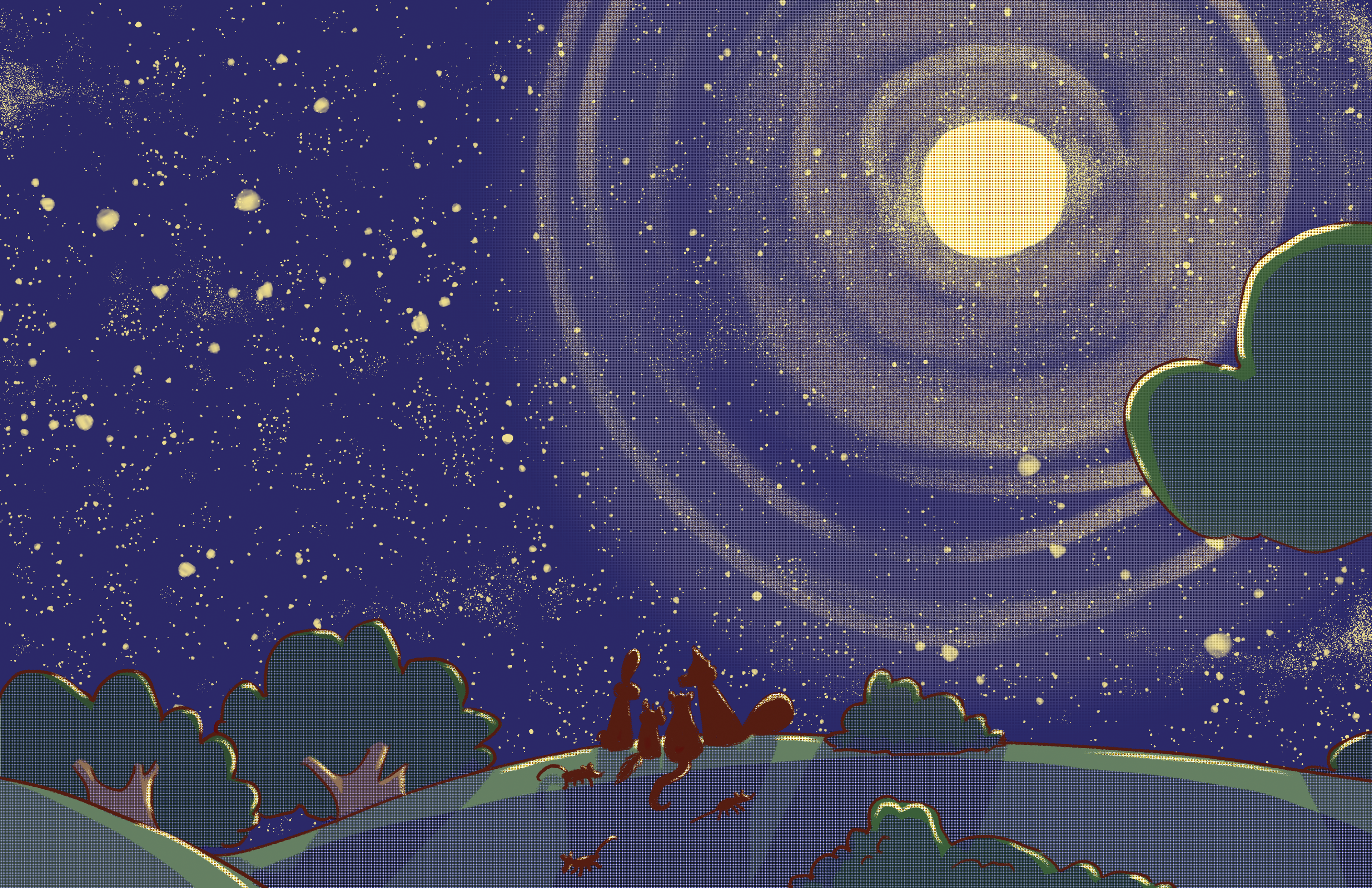
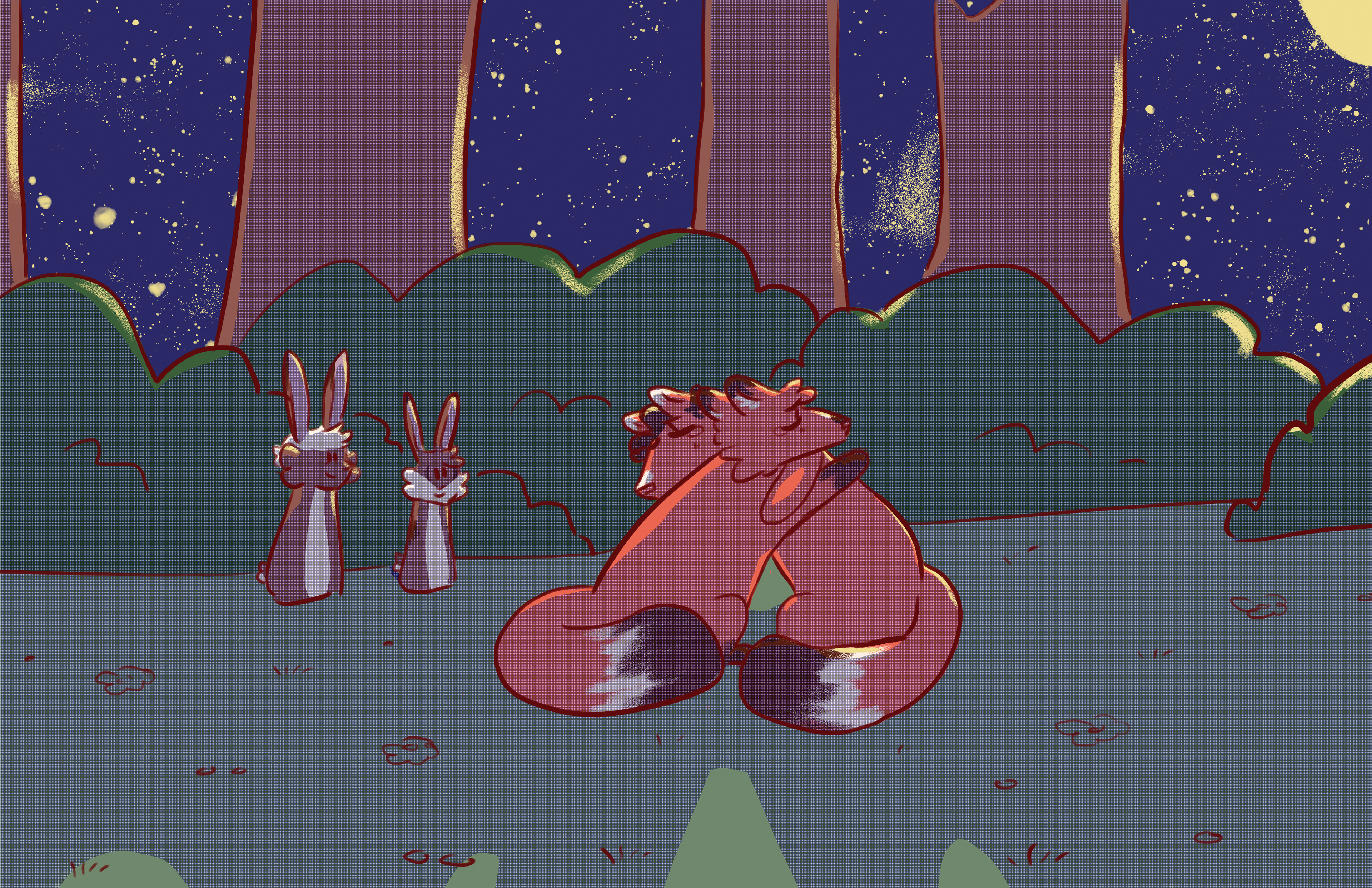
These posters were hand printed using a silkscreen and acrylic ink. They were separated into CMYK (print colors) in Photoshop and each separated CMYK layer was set to a different diffusion and rotation of half tones. Each layer was printed one at a time over each other to create the colors for the poster.
The printed posters can be found in the exhibition photo below.
Shirt Designs
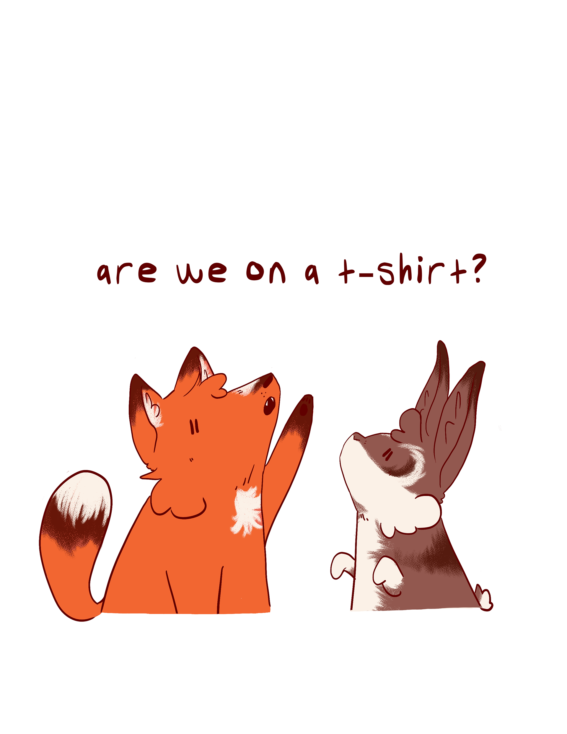
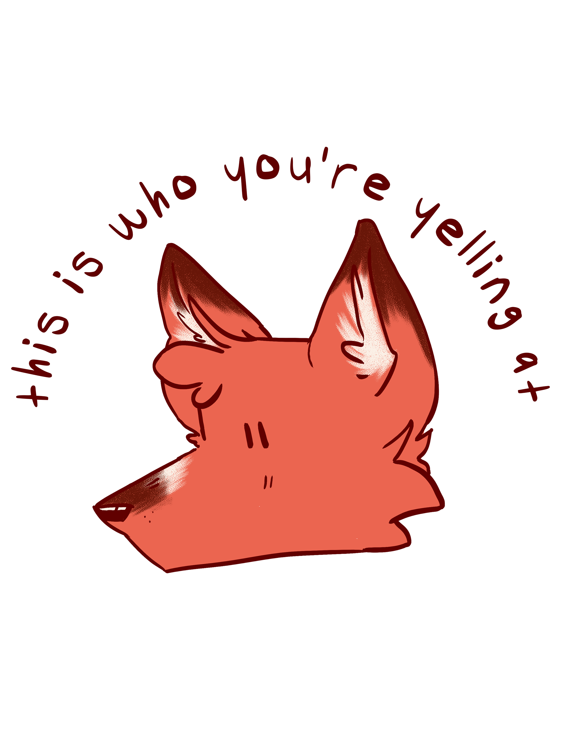
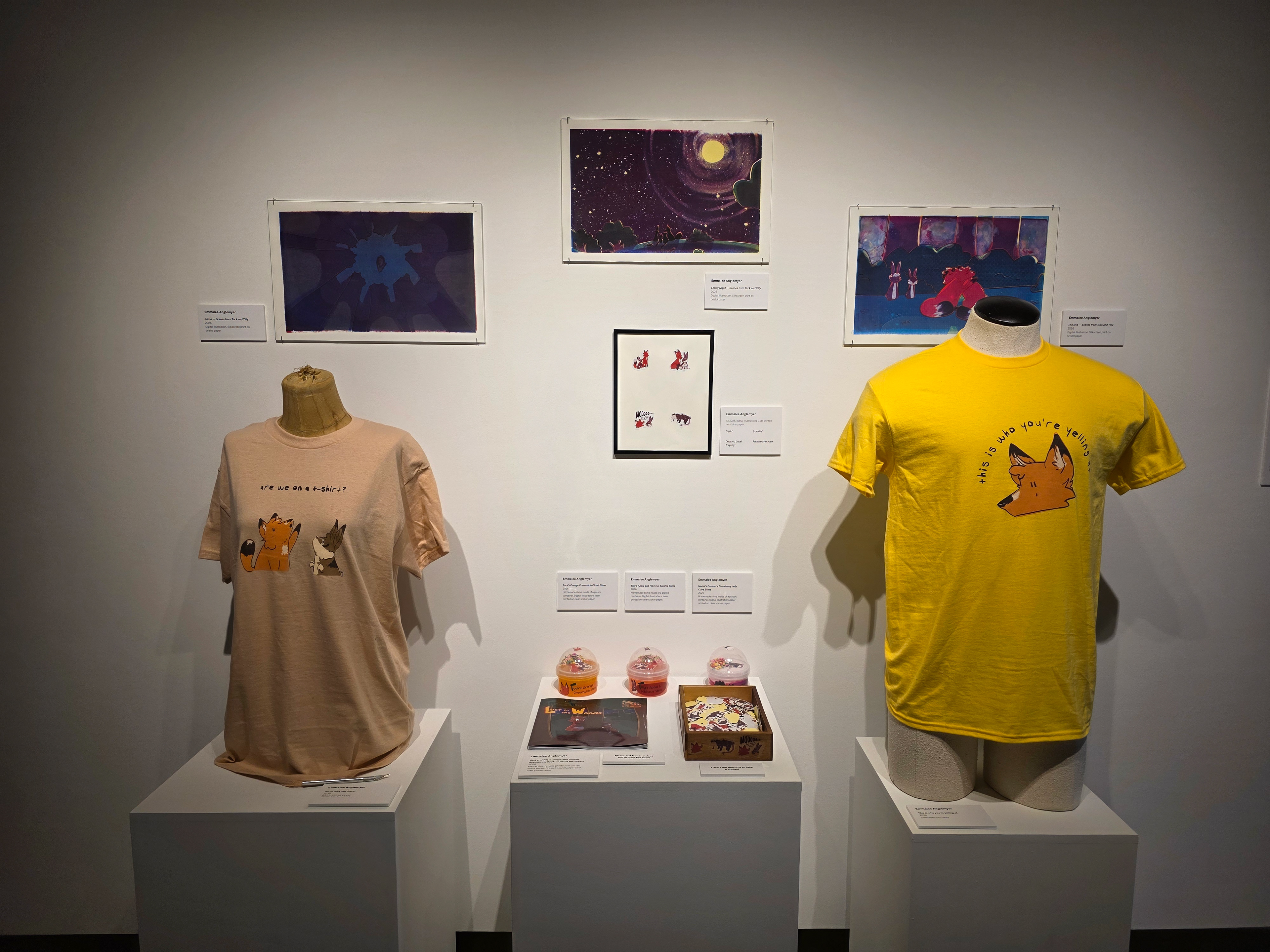
I also hand printed shirts for the exhibition using a silkscreen and acrylic ink. The designs were illustrated in Photoshop, the layers separated, and all printed on a clear plastic sheet to be exposed on the screen. The colors for the shirts were custom mixed using the primary colors.
Slime Labels
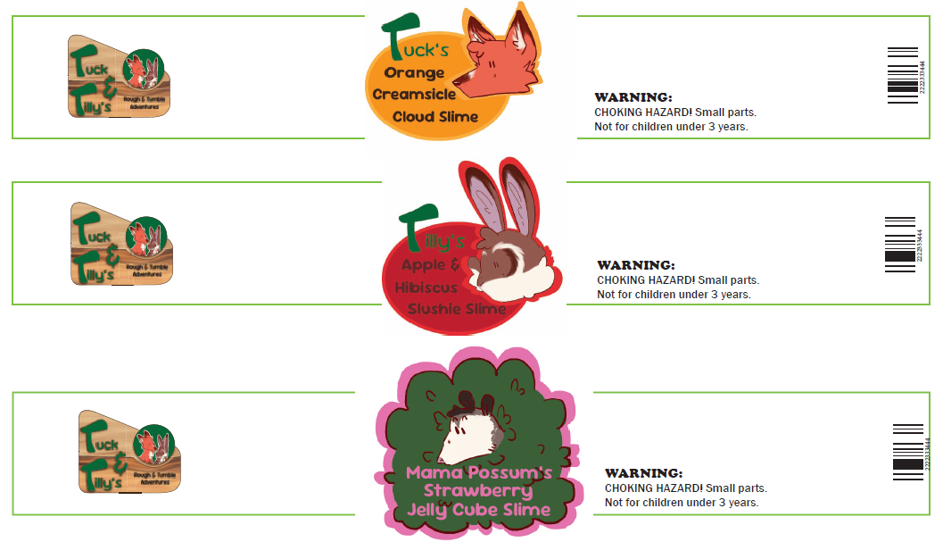
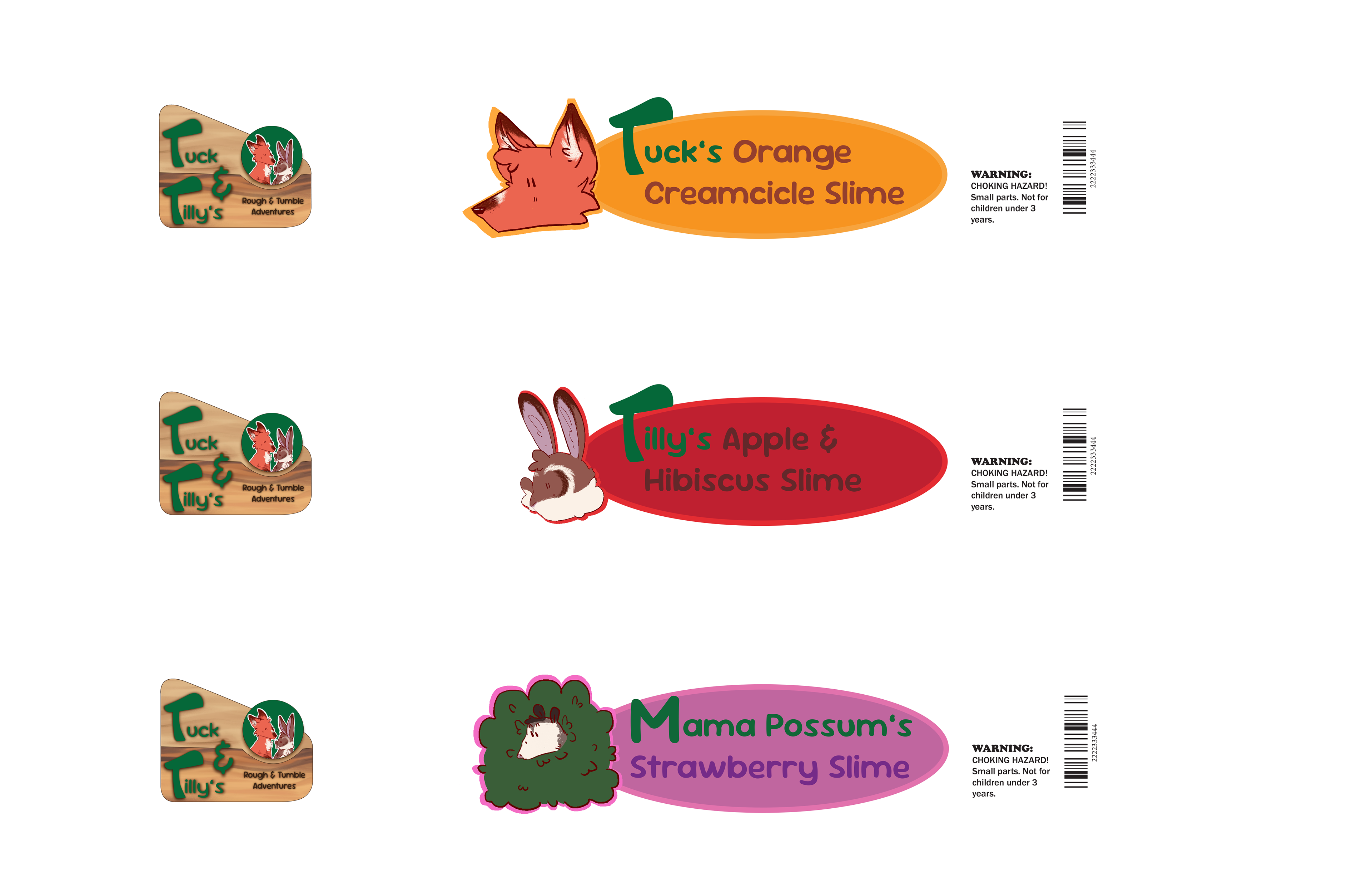
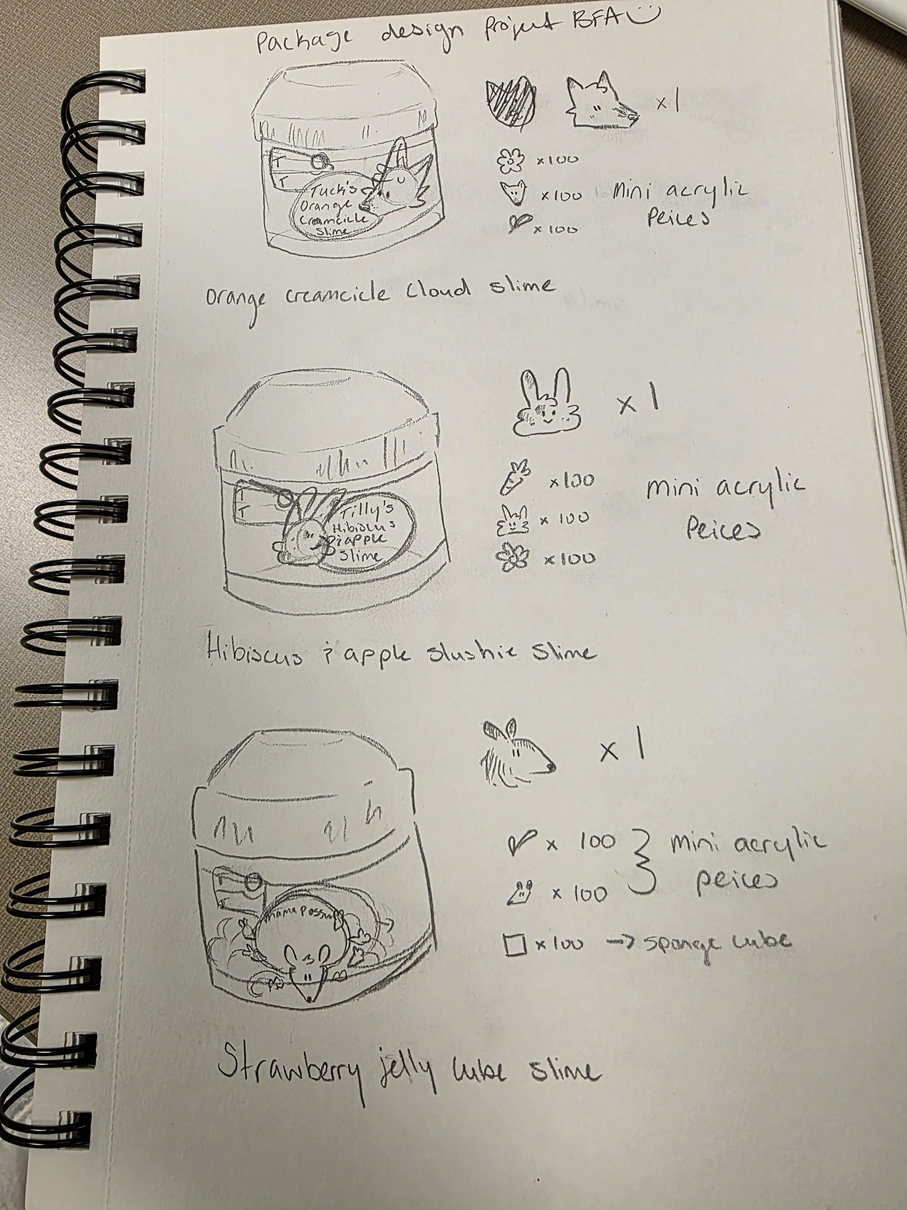
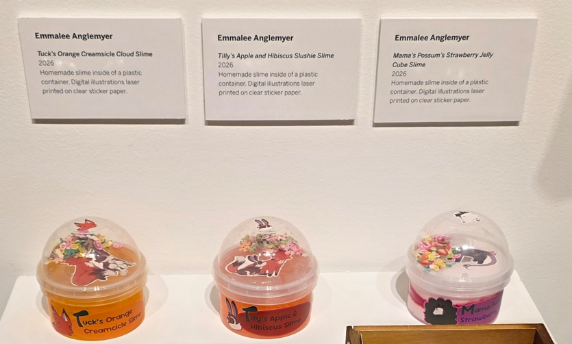
I took a lot of inspiration from a number of already established slime brands to create my packaging for this product. Many slime companies include staples like cute illustrated characters, themed scents, and bright, eye catching colors.
I decided to use very round shapes and typefaces to reinforce the cuteness of the product.
Originally, I used small, circular shapes for my text as well as to contain my illustration, which made things cramped and difficult to read while also leaving a lot of unused space on the rest of the label. After receiving feedback from peers and professors, I extended the text space and customized the text to better fit the Tuck and Tilly brand.
The changes made the labels more readable and recognizable from a distance.